Design decoded: choosing the right font for print is essential for creating a good first impression
If your text could talk, what tone would it be using? Fonts can be described as the visual tone for your organisation. Choosing the right font for your logo and graphic designs can play an important role in how your brand and message is perceived, but with so many fonts to choose from, the selection process can be overwhelming. Follow our tips and have fun with fonts.
Choosing the right font for print: What is font?
We all use fonts yet rarely notice that they are designed. A font is a set of printable or displayable text characters in a specific style and size. The type design for a set of fonts is the typeface and variations of this design form the typeface family. Thus, Helvetica is a typeface, and Helvetica italic 10-point is a font. Font and typeface are often used interchangeably.
Choosing the right font for print: how fonts evoke emotion
Designers have used powerful fonts to create a certain mood for decades, but the power of font psychology to shape individuals’ emotional responses to a brand or logo has only been fully realised in recent years. Fonts that provoke a psychological reaction can be used to make a brand feel more trustworthy, friendly, or aspirational, with designers often turning to emotional fonts to give brand identities a powerful psychological impact.
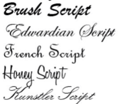
Choosing the right font for print: Script
Script fonts are also known as cursive or handwritten. Letters are generally connected. Script fonts vary from formal and elegant to casual and fun. While not necessarily meant for heavy usage, they are an effective attention-grabber for titles and logos.
Examples:
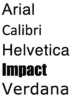
Choosing the right font for print: Sans-Serif
Sans-Serif fonts do not have little feet on the ends of the letters. Hence, the literal translation of these fonts is “without serif”. They are generally viewed as more modern or simple.
Examples:
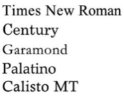
Choosing the right font for print: Serif
Serif fonts have little “feet” or lines attached to the ends of the letters. They are more serious or traditional and have a trustworthy feel.
Examples:
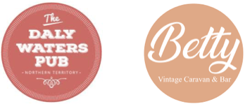
Choosing the right font for print: Handwritten and retro
Handwritten and retro styles are a popular choice. They can provide a homemade, rustic feel. Think farmers’ markets, bars, restaurants and craft beer. There is an element of fun that can spruce up any written message, particularly special offers. Retro fonts can be bold, easy to read and bring a vintage feel to a brand.
Northern Territory examples of retro and handwritten fonts:
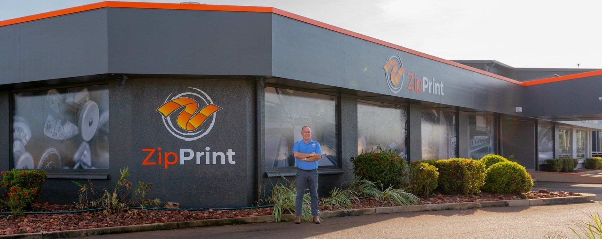
Fabulous fonts: discover the ZipPrint difference
Do you need help selecting the right font for your printed materials? The key to creating memorable flyers, brochures, banners and signage is design. At ZipPrint, we have some of the best printing technology and graphic designers in the Northern Territory. For enquiries, get in touch with our Darwin team on 08 8947 0179.